about_faces: (Two-Face... FOREVER!!!)
Another quick post today. Real life is too busy and hectic with the holidays coming up, and all my free writing time has been devoted to working on something more personal over at my neglected original LJ, [livejournal.com profile] thehefner. Sadly, I fear that I may not be able to whip together a Batman Returns review in time for Christmas, as I'd hoped! Well, until I can pull together anything new, let me at least tide you over with something cool and mysterious I've found, with the hope that maybe some of you might be able to shed light on this.

In my search for rare art by artists like the late, great Marshall Rogers (Strange Apparitions/The Laughing Fish, the Batman comic strip, Dark Detective), I've found four pieces of what is clearly concept art for a Batman project which never happened. More than just art, they include liner notes which hint at story details and show how this take on the characters stands out from the rest.


Thing is, though, I have no idea what the hell this project might have been! There are no details online, no clues, no hints. The only possibility that comes to mind is that maybe they were for the Dark Detective sequel which Rogers had only started at the time of his death, but nothing about these images really jives with the scant info that Steve Englehart himself has provided. So what the heck was this? Let's try to figure it out together!

Four large scans behind the cut! )
about_faces: (Two-Face... FOREVER!!!)
Since real life has once again become far too real to allow free time for the usual in-depth bloggery, I think it'd be neat to post a gallery of Batman villains as drawn by a single artist of note, someone who has an amazing style of their own who also brings something unique to the Rogues. Today, I'd like to dedicate this post to Chris Samnee.


Before he became the artist of such celebrated titles as the late, lamented Thor: The Mighty Avenger, Mark Waid's current Daredevil run, and The Rocketeer: Cargo of Doom (which I haven't read but obviously must), Samnee first caught my attention with the above Two-Face piece, which instantly became one of my very favorite portraits of Harvey. It doesn't hurt that Two-Face is Samnee's favorite Batman villain, something I learned from over at his blog. From there, I scoured through his archives, and quickly fell in love with his artwork.

Like Alex Toth, David Mazzucchelli, and Michael Lark, Samnee's style is elegantly minimalistic, able to say a lot with a little. As I've said many times in the past, I'm a sucker for artists who can pull that off, especially when it comes to characters. Samnee's portraits shine with personality, and combined with his clear affection for the Bat-Family and Rogues alike, I would dearly love to see him take on a character-driven Gotham Underworld maxi-series.


To get a taste of what that might look like, I've assembled every single villain portrait of Samnee's that I could find over at his blog and Comic Art Fans, an invaluable resource for rare original art. Thanks to those sites, I could easily have also included another thirty portraits of the heroes as well, but eh, maybe I'll just put my favorites in the comments or something. Here, it's evil ahoy!

Over thirty more portraits of the bad, the worse, and the ugly behind the cut! )

A great assortment all, but definitely a few notable absences, especially the Riddler and the Mad Hatter. I'd also love to see how Samnee would tackle Killer Moth.

Note: one Two-Face portrait by Samnee that I cannot include is the one which might just be the best of them all, but as you can see there, the image is teeny tiny and won't enlarge. Blast! I left a comment on Samnee's blog asking about it, but no reply has come yet. If one does and I can find a better version, rest assured that I shall post it!
about_faces: (Default)
Hey, everyone! Life has been pretty crappy over the past few days, so I haven't been able to finish any new reviews just yet, much less respond to the epic discussions in my last Rogues Gallery post, but I just wanted to write a quick round-up of remarkable tidbits that've come my way recently!

First off, I want to thank writer Jonathan Larsen for his generous and gracious response to my review of his Two-Face brain surgery story, Together. At his suggestion, I bought the other issue of Legends of the Dark Knight he wrote, which also happens to be his first-ever comics work. The standalone story in LotDK #2, entitled All of the Above, is about Batman versus Amazo, the android who can replicate the powers of the entire JLA, and the two of them battling alone on the League's satellite HQ.


It's a simple story executed eloquently, and Larsen manages to do more with it than just show how the guy with no powers takes down the guy with all of the powers. It's also helped by the artwork of J.G. Jones, thus reaffirming my belief in the review for Together that Larsen's writing would benefit from a cleaner style of art. This story is only 99¢, so definitely pick it up! And speaking of new comics you should buy:


So Walt Simonson's graphic novel The Judas Coin is finally out, not that you'd know from the complete lack of publicity it's gotten. Over the course of a week, the post I was working on has evolved into way more of a long-winded essay regarding the genesis of the graphic novel and the histories of the characters involved rather than a straight-forward review/analysis.

The short version is that I adored it, but it's not going to be for all tastes. Until I can go into details in my review, I'll just say that you'll probably love it if you already love Walt Simonson and/or classic DC historical adventure comics from the Silver and Bronze Ages. If that sounds at all up your alley, I urge you to buy it so we can hash it out in my eventual massive review/essay/rant thing.

That said, it is with great reluctance that I concede one big problem: it's way too expensive at cover price. $22.99 for a slim 94-page hardcover? Yeesh! Even though Simonson made the most out of every page, that's still WAY too much, DC. Thankfully, there are cheaper options, with print copies going for $13.77 on both Amazon.com and Barnes and Noble, which also offers it for Nook for $12.64. Other ways you can get it digitally include Kindle for $9.99 (the best deal of them all), and $12.99 for iBooks for iPad/iPhone. Few are talking about this book and DC has done nothing to promote it, so check it out however you can. And if you are willing to spend the full cover price, then hey, go support your local bookstore/comic book shop!


As a further incentive, here's an awesome Harvey sketch by Simonson.


And speaking of comic book shops (he said, trying desperately to come up with a relevant segue), I've just learned that I need to track down old back issues of Comic Shop News. You know, that freebie newspaper that many shops give away that features solicits, reviews, etc, that everyone probably just glances at and throws out? Well, I'm hoping that not everyone did, because guess what ran in the back of several issues around 1989-1991?


That's right: CSN ran color Sundays for the Batman newspaper comic strip in each issue! Egad, look at the quality of that! That's probably better looking than anything I might find at the Library of Congress archives! But argh, even if I could find back issues (roughly around issues #150-215), I couldn't afford them under the present financial circumstances, so I guess that will just be something to look out for once IRL things get back into shape for me. In the meantime, if anyone knows where I can find scans of these color strips, please do point them my way! I want to be able to include as many color Sundays as I can for The Daily Batman!

Okay, that's enough of an update for now. I was originally going to end with my quick thoughts on the animated Dark Knight Returns movie, but they soon took on a life of their own, so I'll give them their own review later. For now, I'll just say that I liked the film way more than I thought I would, and that it caused me to completely reevaluate my previous views on Harvey Dent's subplot. Pretty impressive feat, that.
about_faces: (Default)


I finally picked up a copy of Rogues Gallery, a collection of DC villain pin-ups to coincide with their potentially-great-but-terminally-mediocre crossover event, Underworld Unleashed.

For those who haven’t read UU, you’re not missing much. Essentially, it was about a tedious Satan stand-in named Neron (DC's answer to a poor man's Mephisto) who offered to give villains an extreme 90’s makeover and power-boost in exchange for their souls. Well, they weren’t using those anyway, right? As a result, we got such silliness as Killer Moth turned into a man-eating mutant monster who caccoons his victims (something so lousy that it was actually a vast IMPROVEMENT when it was adapted for The Batman) and Mister Freeze got actual freezing *powers* (something which was promptly forgotten). Also, UU opened with the Flash’s Rogues getting killed off, solely because Mark Waid genuinely couldn’t figure out how to write them, something which he admitted in a Wizard interview in ‘98. Man, thank god for Geoff Johns, at least when it comes to the Flash's rogues. Basically, the entire UU event was by and for people who mistook scary/extreme/overpowered villains for interesting characters.

That said, Rogues Gallery was still a cool collection of pin-ups by some great artists, especially for the Bat-Rogues. Unfortunately, I’ve been able to find no scans online. I’ve found pin-up scans for other DC villains at a Martian Manhunter blog, a Wonder Woman blog, and a Firestorm blog, but NOTHING at *any* of the Bat-blogs, nor anywhere else teh interwebs! What the hell, Bat-fans?

So, naturally, I’m rectifying this. Here are all of the Batman villain profiles, complete with inane and annoying commentary by Neron that I really wish I could erase.

Look into the face of insanity behind the cut! )
about_faces: (Two-Face... FOREVER!!!)
Welcome to the next installment of my three-part review series which I have dubbed "Harvey and pals!" Why? Because calling it "Harvfield and Friends" probably wouldn't have flown with anybody. That said, now the theme song is stuck in my head...

The first uniting of the Unholy Three ended, unsurprisingly, with defeat and arrest, but this doesn't prove to be the only time that Harvey, the Joker, and the Penguin decided to hang out in their downtime away from schemes and deathtraps. Maybe the events of the previous episode taught these rogues to enjoy (or at least tolerate) one another's company? To paraphrase a character from the wacky cannibal movie Ravenous, "It's lonely being a supervillain. Tough making friends." Perhaps that's what led to the scene of villainous socializing that occurred in one of B:TAS' best-ever episodes:


Wherein several of the rogues play cards and trade stories about how they each almost killed Batman, but there's more going on than meets the eye. Watch it here!

I threw a r... well, you know the rest. )

As a bonus, I am delighted to present to you something which I found whilst scouring for rare B:TAS/Two-Face memorabilia, especially limited edition collectibles from the late, lamented Warner Brothers Studio Store chain of shops. That store would often carry animation cels, lithographs, and other cool works of Batman art, and it's so hard to find good-quality scans of them anywhere online. Thankfully, I found a fantastic scan of this, one of my very favorites:


Man, forget dogs playing poker, I want this hanging in my den whenever I play cards and smoke cigars with the boys. Not that I play cards nor smoke cigars, nor do I even have boys anymore. Whatever, I still want it anyway. That and the other WB Studio Store sericels of the Rogues:


There is not a single one of these that I don't love. There were at least two others in this particular series of character line-ups, including one of the heroes (like Robin, Commissioner Gordon, Renee Montoya, and even Harvey Dent!) and a second one for the villains! Sadly, I haven’t been able to find the first one at all, and the only scan I’ve found for the second is this grainy, teeny one here:


So yeah, if you know where I can find better quality images of these awesome works of art, let me know.
about_faces: (Default)
Some of you may recall when I posted about artist Nate Ballegarde's sketches of the Joker and Two-Face about a year and a half ago. I was a bit mixed on his Joker, but I loved his Two-Face, especially one sketch in particular which I thought was absolutely stunning and a pretty-darn-well perfect portrait of Harvey:


In an extra bit of awesomeness, Mr. Bellegarde himself ([livejournal.com profile] fetorpse) actually chimed in to comment on my own comments, during which he mentioned that he was planning on doing that sketch as a full illustration, which he would then sell as a print. Which, of course, was incredibly exciting. But of course, a year and a half went by, and there was no news on Mr. Bellegarde's front, and I started to wonder if maybe that was just going to be one of those projects that fell by the wayside, as so many of my own projects have a way of doing.

And then, as I was Tumblr'ing through the usual blogs, I noticed something new on fyeahtwoface that caught my attention:


Quoth Nate: Uhhh I am pretty excited to announce this little biddy Two-Face print I will be selling at SDCBC this week. They are 11x8.5 inches on nice glossy paper and I will sign them for you and everything! Whatever I bring home from the con will be available to everyone else on Earth to buy online. Hooray!

Hooray indeed! Although Henchgirl has voted any prospects of buying this as a print unless I agree to have it out only when we're hosting company that we want to freak out. I can deal with that.

That said, in all honesty, I’m not sure which version I prefer! I think I just barely prefer the look in Harvey’s good eye in the sketch to the print version, especially the way he seems intensely lost in his own tormented thoughts rather than looking at himself in the reflection. That’s the one thing that really endears me to the original over the finished version, whereas everything else is pure, horrifying, haunting sex. Good god, that’s how you make Two-Face look stylish and utterly disturbing at the same time. WANT.
about_faces: (Two-Face... FOREVER!!!)


Honestly, I could devote a whole separate fanblog just for the Harvey Dent from the various DC Animated Universe properties*, from B:TAS all the way to today, as that version of the character still manages to endure in fandom.

At first, I thought about doing like I did with the Who's Who posts and just writing about EVERYTHING there is about Harvey over fourteen daily posts in an event which I was going to call Two Weeks of Two-Face in the DCAU. Of course, I soon realized that such a project would not only be overload for everyone involved (especially me!), but it also wouldn't do the character justice. And if anyone deserves justice, it's Harvey Dent. /I see what I did there!

For a whole generation, the DCAU Two-Face was the definitive version of the character. Sure, the Nolanverse owns the current generation, but B:TAS seems to still have a healthy following nonetheless. At the very least, I'm certain that the DCAU Two-Face will continue to be more popular and influential than, well, any version from the comics. I dare say that'd be true even if we lived in a better world where comics would be as popular and well-known as cartoons and movie (*weary sigh*). But even as a fan, I never gave much thought about just WHY this Two-Face was so great, much less the work that went into making him that way, until I discovered the actual B:TAS writer's bible on World's Finest Online, the single greatest resource for all things DCAU and beyond.

Reading that writer's bible, you can see that so much of what made B:TAS in general so brilliant was no accident. It wasn't just that a handful of smart writers tried their damnedest to tell great Batman stories. These people had a vision, and set themselves with high standards right from the outset. Even though many of those plans in the bible were changed or scrapped before the first episodes even made it to air, the importance of that foundation cannot be understated, and you may be surprised just well the greatness of that show was planned from the outset.

Which, naturally, brings us back to Harvey. Before we look at any of the DCAU episodes, comics, toys, merch, Happy Meal boxes, and so on, let's look at the roots of Two-Face in the DCAU--the design, the groundwork, the plots, the voice, and more--as we examine what was planned... and what was changed.

Behind the scenes, behind the cut! )


Next time: Harvey's very first (and very brief) appearance in On Leather Wings, followed by a major role in The Batman Adventures comics, which I consider to be the very best appearance of pre-insanity Harvey in the DCAU.


*Honestly, I could write a couple hundred posts just about the DCAU villains in general. I'd love to look at all the Mister Freeze stories, since the DCAU comics fill in the gaps between episodes and Sub-Zero that, combined with his finale in Batman Beyond, make for a powerful tragedy in epic scope. I mean, even more powerful than the one people already know if they've just seen the episodes. The comics, as I was reiterate throughout these posts, are THAT good.

**The fact that Harvey, Thomas Wayne, and the Bat-Computer all have the same voice raises a few questions about Bruce. Did he pattern the Bat-Computer to sound like his father or Harvey? Is he friends with Harvey because the latter sounds like his father? INQUIRING MINDS THAT READ TOO MUCH INTO THINGS WANT TO KNOWWWWWWWW.
about_faces: (Default)
I've been getting some questions about whether or not I know that Deptford--the artist who did the amazing Two-Face fancomic The Silver Dollar--has since been doing an entire storyline with Harvey for the past few weeks. The answer is, "Oh my god, yes, and it is awesome."

I've been sorely tempted to post it strip by strip, but I want to hold off until it's all wrapped up to review it in one megapost. Partially, I want to have it all in one chunk for posterity, but more importantly, there's a lot that Deptford is doing that has me both thrilled and anxious, and I dare not make any judgment calls until it's all wrapped up.

But don't let me stop any of you! If you want to read the strip, start here and go backwards! If you want to post your thoughts in the comments, by all means, I'd love to hear what you think! Otherwise, feel free to wait with me until I post the whole story once Deptford sees fit to wrap it up, presumably in the next week or two!

Meantime, I've got a long post coming up, all focusing on the short-lived history of a character that nobody likes. When you'll see it, you might wonder why the hell I'd ever want to devote such a lengthy post to such a worthless character? I'll give you a hint: it has to do with something in my introductory post to this blog, before it went and took on a life of its own. Hopefully you'll dig it.
about_faces: (Default)
Today, I bring you a post which I fear may be unreadable. At least, if you don't own old-school 3D glasses. And even then, can 3D be viewed on a computer screen? Either way, I'm gonna ask you to bear with me as we look at selections from Batman 3D: Ego Trip, a graphic novel by comics legend John Byrne with effects by 3D master Ray Zone.

I enjoy Byrne's story and art here quite a lot, but I had a damn hard time settling into it in either two or three dimensions. Obviously, 3D isn't meant to be viewed without glasses, and while the actual 3D effects are often spectacular beyond the sheer novelty value, my eyes can't really handle it for long stretches. I wish they'd rerelease this story in 2D with coloring, so Byrne's story and artwork could be appreciated on their own merits, even with all the panels of various objects COMIN' RIGHT ATCHA!

So as I'm going with the assumption that we're all here to focus on the story, let's squint and try to take a look at Ego Trip, a Batman caper written in 1990 but with a distinctly old-school feel, guest-starring four of his greatest villains (including, naturally, Two-Face, who gets a slightly tweaked origin here) as they torment Batman and cause him to trip balls:


IT'S LIKE YOU CAN TOUCH THEM behind the cut! )

As a bonus, Batman 3D also included a pin-up gallery by an all-star roster of artists. Because I love Batman pinups, here's the whole lot!

Toth, Adams, Zeck, Gibbons, and more! Holy crap! )


As always (well, as usually), I've made certain to post no more than 1/3rd of the graphic novel's content, so there's plenty more to read for those who can track down this hard-to-find book. It's available for pretty cheaply used on places like Amazon.com, although there's no telling whether any copies will still have their glasses. Proceed with caution! If you have a local comic shop that might carry it, always try for that first. It's definitely worth checking out in whole. Hopefully someday, it'll find a new audience. In either dimension.
about_faces: (Default)
Today, io9.com ran a feature about artist Dean Fraser's mock-concept-art for a fictional Star Wars: Empire of the Bat mash-up.


The author of the io9.com article added, "I'm still holding out for Mr. Frwampa, Maxie Greedo, Ewokwoman, Boba al Ghul, Poison Sarlacc, IG-Chill, and the Killer Rancordile."

...

It... look, ALL I'm saying is, how could both the artist and the io9.com writer have missed including what I would assume to be the single most obvious mash-up: Lando Two-Face? Just saying.
about_faces: (Default)
Hey. How's it goin'?

Since LJ is still under DDoS assault and I am thus unable to respond to a number of comments from you fine folks, I figure that this might be a good time to bring up the fact that I have started an About_Faces account for Twitter. I don't update much, and most of what I do update with is just to alert whenever I post something here at LJ, but I figured it would be a good idea. All part of my grand scheme to become the King of all things Two-Face, and the... um... reasonably powerful feudal lord of all things related to the Batman villains in general!

Tangental rant: Because really, it seems like the villains need more love these days. Now, you wouldn't think that'd be a problem. I mean, they're the Batman Villains, for Grodd's sake! But these days, it's like fandom is more interested in the Bat-Family than the Bat-Rogues, with more fan love centering around Dick, Tim, Jason, Babs, Steph, Cass, Damian, and Terry rather than Harvey, Pam, Eddie, Ozzie, Squishy, Vic-F, Vic-Z, Jervis, and pretty much everyone who isn't the Joker and/or Harley. Love for heroes over villains? Doesn't that fly in the face of all fandom? On top of that, the upcoming crop of DCnU Bat-Books will be carrying on the Grant Morrison tradition of All-New Villains, which strikes me as unnecessary and wasteful. Why flood the market with far more villains who will just end up being cannon fodder in tomorrow's Face the Face-style kiss-the-D-listers storyline when you have a couple dozen excellent pre-existing characters going under-developed and unloved? I'd argue that it takes LESS imagination to create a new character than it does to find something new to say and do with a pre-existing one. /Tangental Rant

So in these times when people are forgetting how great the Rogues are, I've been thinking about expanding about_faces' mission to looking at the villains in general, going so far as to consider starting up a FuckYeahBatmanVillains account. Thankfully, a FuckYearBatmanVillains already exists, and it's awesome. It's just a daily dose of happy, even including more obscure characters like Hugo and Ratcatcher. I told the maintainer how much I loved it, and he/she linked to here, which is awesome! ... Well, except for the DDoS attack making it near-impossible to most to leave comments, much less actually get LJ to load. In my IRL persona, I'd refer to that turn of events as being rather "Hefnerian."

Through FuckYeahBatmanVillains, I also discovered a FYeahTwoFace Tumblr, which is pretty self-explanatory, and equally as happy-making. I was already loving the hell out of FYeahTwoFace before I discovered that, hey, I think they (or one of the contributors) follows this very blog! Neato! The Capullo Bat-Villains image linked to my most recent entry, and I dare say those are my scans of that Azrael story where Harvey pulled a Christopher Walken from Pulp Fiction! Neato! If anybody behind FYeahTwoFace is reading this, keep up the great work!

If you need to kill some time, those are the two Tumblr feeds to check out! I scoured through and saved tons of great images, but there are three Harvey images in particular I hadn't seen before, which deserve special attention.


I love this piece by Eric Cante, which reminds me of Nate Bellegarde's amazing sketch (when're you gonna make that into a print, Nate? I have money that should be better spent on diapers and formula that could be yours!), which gives you only a hint of the scarring. The lanky design strikes me as this being Two-Face by way of Gabriel Ba's Casanova and Cowboy Bebop, which just gives him a general air of slickness that I dig. For all the brutality of his actions, Harvey here doesn't seem particularly happy, like he's a badass who's all business.


Maybe I'm just a sucker for the vest-and-holsters look, but I love this piece by Adam Withers. I can't put my finger on why, but there's something about the jacket lying at his feet that just works, and the scarring is uncommonly creepy.


I've seen Dan Hipp's artwork featured on various comic sites before, and I've always enjoyed it, but this one blew me away. Not just because it's Harvey, as he's drawn Harvey in the past, but because--like Bellegarde and Steve Lieber before him--he captures the character of Harvey Dent above and beyond his grotesquery. It's all in the hunched-over pose and pensive look, which show him as a burdened character. The very best Two-Face images are the ones that show that burden, in my view. I also love the limited use of color, especially how it's used for the coin. I'd buy the hell out of a print of this. After checking out Hipp's wonderful artblog, I think I'll dedicate an entire post to rounding up all of his Batman related artwork sometime.


That's about it from me for now. Apologies if the HTML is screwed up, as I'm not sure I'll be able to edit this post until LJ gets fixed. I have a couple more posts in the works, including--finally!--a new analysis of a classic comic, and maybe a proper review of Tony Daniel's recent Harvey/Gilda mediocrity. I'm a bit too underwhelmed to feel any particular drive to review that story, so maybe I'll hold off until I can first look at Two-Face Strikes Twice! and The Long Halloween, once I get my scanner back in working order.

Oh, and the next chapter of Dent will be on the way soon, too. Thanks to everyone who's reading and commenting so far. I'll get back to your feedback once LJ lets me post comments!
about_faces: (Default)
I first learned of Ming Doyle ([livejournal.com profile] _ming) through her superhero costume redesigns on Project: Rooftop in general, and then specifically when she beat me out in the P:R costume contest with a great home-made Batgirl costume that, in retrospect, is what Cass Cain should probably be wearing instead of whatever it is she's in now.

I always liked her character designs and composition, but she really commanded my attention when she went on scans_daily back in the day and posted her short-but-sweet fan comic Lady Gotham, a rare story to actually focus on Martha Wayne. Very, very cool stuff. I went to check out her website some time ago to see what other Bat-character bits she's done, and found one that obviously took my attention:


Even if this weren't pretty much the only Harvey Dent fan comic (if there any others, especially any of note, please let me know), I'd still consider this the best. It's a bit abstract, like poetry of the mentally ill, and rather haunting.

The version I'm posting here has been taken from Ming's DeviantArt account, although it can also be found here at her LJ account. Oh in case you're wondering what's up with the henchgirl characters, they're called "the Miss Malones," and Ming gave the full run-down about who they are over here. I don't know if you'd prefer reading that before or after the actual story (it doesn't really spoil anything), so I guess just flip a coin and go ahead.


They've got the wrong man in here... )

Ming had one more rather interesting Harvey-related tidbit she posited a question: "who would you rather be entangled in some variety of hypothetical romantic interest with, harvey dent before his two-face transition, or "bruce wayne" at any point after his world wanderings with the catch that you'd never know about the other side of the proverbial coin?"


"i'm honestly stuck on which option would be the more perfect setup for a psychological horror movie."


I'll leave you guys to debate that one. :)

I wish Ms. Doyle would do more Batman comics, but I imagine she's distracted by being a professional artist who, y'know, actually likes to draw things for which she'll get paid. How dare she?! In that respect, DC simply must hire her for a short story or two in an upcoming Batman 80-Page Giant, or something to that effect. At the very least, once I have the money to blow on original artwork (which won't be for a long time, what with baby on the way very, very, very soon), I'd bloody love to commission a portrait of Christopher Dent from her. She'd capture him perfectly as I see him in the Dent novel.
about_faces: (Default)
I've found a handful of little things which don't really warrant posts on their own, but by their powers combined, you get a thinly-connected grab-bag assortment of Two-Face goodies and baddies alike!

Chris Sims at Comics Alliance gave a feature story wrote a feature story about the Capcom-style fan-made Batman fighting game that's still in progress. I think one of the creators commented to me about something on an old scans_daily post, but maybe that was somebody else trying to create MUGEN Batman character sprites. Either way, what we've seen so far is damn exciting, but you can guess the part that really got my interest, right?


Really, all you need is a courtroom setting and you're good. Hell, maybe then someone could finally create a piece of Two-Face fanart with him doing a proper Phoenix Wright "OBJECTION!" In a better world, where the character would actually be popular with fans, we'd have seen that sort of thing yesterday, right alongside a Two-Face mashup with Harvey Birdman: Attorney at Law.


Why yes, I would indeed buy that for a dollar. Thankfully, the game (if it's ever completed) will be free, unless DC realizes the potential here and actually gives these fans money to get it properly produced. They reportedly have a long, long way to go yet before it's completed, but they're still dedicated to the project for the time being. Would that I could find their actual site or blog where they could update with their progress from time to time!

There's so much I'd love to see in this game. Like, maybe the Joker could use a crowbar to beat up a Robin. Or Two-Face could use a baseball bat to beat up a Robin. Or the Riddler could run a Robin over with a tank. Why a tank? Because fuck Robins, that's why a tank. Hmm, I think my sleep depravation is showing.

And speaking of video games, let's look at a real one, now that alert reader Vito tipped me off to this "secret tape" from Batman: Arkham City. God, it's like every time I think I'm done with this damn game, something pulls me back in again! But how could I resist a dialogue exchange written by Paul Dini (I assume) featuring the first-ever meeting of my two all-time favorite Batman villains, Harvey and Professor Hugo Strange?


Ohhhhhh, so many conflicting feelings. First off, I'm annoyed that after DC Universe Online, this is the second time that we've had Harvey's face (body?) scarred by Falcone, not Maroni/Moroni. Why the change? Hell, Falcone's arguably LESS well-known and related to Harvey than Maroni thanks to The Dark Knight.


But I'm more annoyed by the snarling, nasty, humorless Two-Face character here. When I was lamenting the sad lack of Two-Face fic on FanFiction.net, Henchgirl summed up a major reason why Harvey has so few fans in fandom: he lacks charisma. I feel like this take on Two-Face is a perfect example of what she means. There's not much here to really love or even like, just a self-righteous monster who needs to be kicked in the face and taken down. Compare that with the other "leaked secret tape" of the Riddler vs Hugo, where Eddie isn't depicted perfectly, and yes is still practically sparkling with charisma compared to Harvey. That said, I do like hearing the voice shifting from good side to evil and back again, which gives him some dimension.

I also think I'm in love with Hugo Strange's voice performance, and the way he's properly being written as a psychologically manipulative bastard. I wonder what this game will do to his non-existent fan base over the next few months. He can also be heard in the third and final (so far) leaked audio interview, this one between him and Catwoman. I'm still not digging her voice (it's supposed to be Grey DeLisle, and if so, it's the weakest performance I've yet heard from that talented actress), but I like that Holly is canon in the Arkhamverse. Take THAT, everyone who hates the Miller/Brubaker origins!

And speaking of Arkham, I just found a fascinating Two-Face sketch by Arkham Asylum: A Serious House on Serious Earth artist Dave McKean:


McKean has expressly said that he didn't care about the Batman characters when he did the story, which I think helps give this sketch such a uniquely abstract flair. I could and will eventually rant at length about McKean and Morrison's graphic novel, but I can already tell you that most of my positive notes will be about McKean's artwork, which I love (but not without reservations and considerations). This sketch reflects that. It's not my favorite Harvey sketch, but it's one of the more interesting I've seen.

And speaking of sketches, I was just remembering the failed Portraits of Villainy project that Dini and Alex Ross were going to do, but which DC rejected. Like their tabloid-sized Secret Origins book, I believe it was going to be two-page origin portraits of several DC villains.


I go hot and cold on the work of both creators, but as a great fan of villains, I'm very sad that this never happened. At the very least, I wish these could have been inked and painted up properly. Even in pencil, I think the Penguin one is my favorite. I like how he's focused on Harvey's good side because, well, not enough people focus on that aspect. At the same time, I'm especially sad that we didn't get to see a full Dini/Ross origin for Harvey, considering that Ross (at least, over Doug Braithwaite's pencils) painted one of my very favorite depictions of Harvey's scarring.
about_faces: (Default)
Sometimes, seeing online scans of a comic I've already read allows me to read the story in a different light, sometimes to such extremes that it makes me feel like I'm only now reading it for the first time.

Such was the case when [livejournal.com profile] tungstencompton posted snippets from Denny O'Neil's "Duel," the first Legends of the Dark Knight Annual, starting with the opening sequence by Jim Aparo. Now, this comic didn't do much for me the first time I read it, but seeing these excerpts online gave me a whole new appreciation for this story, and what it means to one of the most controversial Batman questions out there. But to actually say what that question is would be a spoiler in of itself.

So with permission from the OP who scanned the pages in the first place, I'm reposting the Aparo pages here for several reasons, not the least of which being that I think it's some of Aparo's best artwork ever:


(Ala Brad Pitt) What's in the bag, what's in the bag? )


After his glory days in the Bronze Age, Aparo's art seriously seemed to go downhill once he let himself be inked by someone else in stuff like A Death in the Family. Even when he inked himself again after that in stuff like the Knightfall era comics, it just wasn't the same. He seemed more stuff, less dynamic, more of a relic from a bygone era rather than a timeless master as fans like me have always seen him, and always will.

Looking at the above scans, I have to wonder if he was just let down by the poorer printing and coloring quality of regular Batman books, as opposed to LOTDK's prestige format. I'm not sure he ever looked quite this good in any story since, with the possible exception of the GCPD police mini-series, since Bill Sienkiewicz's inking makes EVERYBODY look better. But there's nothing quite like the pleasure of Aparo inking and lettering himself in stories such as this and this.

That said, I do make some exceptions, mainly where nostalgia is concerned. For example, I'd give up a moderately-sized toe to own this:


That right there is the first page of the first comic I ever read, and I'm incredibly jealous of the guy who actually owns it. Needless to say, this page had quite the lifelong impact on me.
about_faces: (Default)
I've been noticing the cinematic artwork of Justin Reed ever since I saw his great take on the titular stars of The Good, the Bad, and the Ugly. His work pops up on film geek sites every so often, and it makes sense, as his pieces are warped tribute pieces to great films and film in general. Personally, I run hot and cold on them, because some feel more like cobbled-together collages, and I think his Spider-Man movies piece is a good example of what I mean, where half of the characters kind of tacked on and out of place.

That said, I have to give special attention to his tribute to The Dark Knight. Actually, it appears to be his second piece (here's the first), and how appropriate considering the subject matter:


This might just be my favorite piece of TDK artwork, as well as my favorite take on the film's Harvey Dent. I love that it actually plays with theme in ways that are obvious to me but are pretty much ignored by everyone. Everyone remembers and celebrates the Joker*, whereas Harvey and his arc are pretty much forgotten (possibly because the arc was botched in the last twenty minutes, but that's another rant). So it's great to see someone outright depict Harvey as he should be, torn between the Batman and Joker's extremes, and emphasizing how he embodies the soul of Gotham City itself hanging in the balance.

Between that and the fact that Reed uses this very image of Harvey for his blogspot profile, I think it's a safe bet that this artist appreciates the character in ways that many don't. I rarely collect, much less display, Two-Face stuff from TDK, as I far prefer to celebrate the character in comics, but if Reed put this image out as a print or poster, I'd be first in line to order one up.


Note to fandom, especially in fanart and cosplay: there is more to the Joker than Heath Ledger. Stop narrowing the entire character down to that one specific interpretation. At this point, drawing on the Joker from The Killing Joke would be considered an exception. That's sad. Please read comics. Thanks.
about_faces: (Default)
Alert reader [livejournal.com profile] deadwalrus reluctantly tipped me off to this Bleeding Cool article, revealing new Batman artist Greg Capullo's sketches of Jim, Joker, and Harvey in the New DCU, Post-Not-Reboot-Whatever-Thing.


I don't think that anyone, in the history of comics, has drawn Jim Gordon doing his best Tony Stark "How YOU doin'?" impression. Frankly, I'm just a bit surprised that he doesn't look like Twitch from Sam and Twitch, since this IS the big Spawn artist, after all. Now if he can somehow draw Harvey Bullock looking different from Sam Burke, then I'll be really impressed.


... Well, it's certainly original. I don't hate it, and at least it's not Morrison's bullet-holed perma-grin Joker anymore, thank god... but it may take some getting used to. Doing the darkness-around-the-eyes thing with added pin-markings under the eyes like a clown out of the commedia dell'arte, it's interesting. I think what really distracts me as the eyebrows. It's like Wilford Brimley playing a Vulcan. The hair has apparently given others flashbacks to 80's synth bands, it reminds me more of Brad Dourif (specifically as Billy Bibbit from One Flew Over the Cuckoo's Nest) and that's never a bad thing when it comes to the Joker. Never. If your Joker looks even a bit like Brad Dourif, you're doing something right. That should be a guideline followed for all artists, just as all writers should try to imagine their written dialogue being read aloud by the Batman: The Animated Series voice actors. If your Harley doesn't sound like she could be performed by Arleen Sorkin, then generally speaking, you've written a bad Harley.


Oh dear.

First off, I kinda like what's going on with the good side. From this sketch, it looks like this could be a Harvey who has some personality, which so many artists forget when it comes to drawing his unscarred side. That's the side that needs to be expressive and have character, and not just be a standard generic thug in appearance. Maybe some of that will come through here. But the scarred side... he looks like a zombie out of an EC comic or a Bernie Wrightson drawing. Harvey looks less like a burn victim and more like a corpse who's falling apart before our eyes. If he ever ran away, Batman could just follow a trail of face leavings. Ew. As for his missing eye, I'm guessing/hoping that Capullo is just taking a cue from Lee Bermejo's Two-Face in Joker and keeping it shadow. While I know it's realistic for a burn victim like Harvey to have lost his eye, all it does here is emphasize the corpseness of his appearance.

All in all, I'm kinda interested, but still very hesitant to care much. What's more, I don't know how this art's gonna look once it's all inked and computer-colorzied. I'm gonna quietly prepare for the worst, so that anything good that comes will be a happy surprise, just like I did with the Green Lantern movie. Sometimes it pays to be a hopeful pessimist!
about_faces: (Default)
My scanner's out of commission for the time being, which will make my ability to post reviews rather interesting over the next couple months. On top of that, the unholy spawn of Hefner and the Henchgirl should be born within the month (it damn well better!), all while we're in the process of moving AND while I'm ramping up to perform at the Capital Fringe Festival here in Washington, D.C.

What does this mean for about_faces? That depends. I have a handful of scans for things which I'd meant to post about at some point, including the Gilda-specific aspects of Two-Face Strikes Twice! and The Long Halloween, although not the rest of those stories, so full reviews will have to wait until later. Aside from that... well, you guys might finally be starting to see some fic of my own here, as Henchgirl has been pushing me to gradually release my Harvey Dent novel here, the one which I've been writing for... about five years now? What am I on, draft eleven? Thereabouts. I think it's finally ready to be done.

So keep your eyes out for that, if you're so inclined. And for folks who prefer reviews/scans/news, I'll scour through my photos and see what I can use to pepper up about_faces so it doesn't totally become my own personal fic dispensery. I want this place to be about Harvey Dent and the Bat-Rogues, not just my own personal take on Harvey Dent and the Bat-Rogues.

To emphasize that commitment, I offer you one of my favorite pin-ups ever.


Aparo makes me so happy in places that like happy things. I even love the fact that they've all apparently chosen to drink champagne out of martini glasses, because they're classy AND they break all the rules!
about_faces: (Default)
One of the (unsung?) greatest talents to work on Batman comics in any format, Ty Templeton, has started posting unused cover and concept art from his work on the various Batman: The Animated Series tie-in comics. If you're like me, each of these posts are a little Christmas.

So far he's only done a couple, starting with the early drafts of the cover for the greatest Ventriloquist and Scarface comic ever made (man, I got hyperbole out the wazoo today, don't I?), and it's hard to tell which cover I like best. Ultimately, I think he made the right choice, but dear god, I want to see the rest inked and colored for proper pin-ups! In the comments, I of course put in a request for rejected Two-Face drafts, a request which was seconded (hurr) by the next commenter.

Today, Ty posted original cover drafts for Batman: Gotham Adventures #2, a story which I've actually posted at my regular LJ, but not here yet, which I should properly do at some point seeing as how it's frelling fantastic.

I'd like to think that maybe my comment inspired his next post, but it's just as likely that he was going to do it anyway considering that he writes: For the time I was on the various Batman books, I tried to make sure all the #2 issues (including #12 and #22) were Two-Face stories. Not just because of the obvious connection to the #2, but it allowed me to write a Two-Face story at least once a year. Considering he’s one of the best characters in fiction, I’m no fool, and I wanted at him as much as I could.

As I've always considered all of Ty's Two-Face stories to be among the very best ever written, it's fantastic to outright hear that Ty loves the character. For a villain who doesn't get much love in fandom (Henchgirl's talking me into starting up the first and only Two-Face-centric art collection group on DeviantArt), Harvey's really loved by a discerning handful of fans and creators. That love isn't usually expressed loudly the way Harley and Joker fans express their passion, so it's cool to see it mentioned by a master like Ty in such a matter-of-fact way. Like, "Yeah, he's one of the best in fiction. It's a fact. Moving on."

As for the rejected covers themselves, I think the very best was the fourth one, with Harvey in the background dominating the light and shadow while Batman and Batgirl fight thugs in the foreground, but I also have great fondness for the fifth, with the full-body shot of Two-Face. That one looks like a movie poster, one that could out-Scarface Scarface. What all these covers have in common is how they play with light and shadow, and in that respect, the final used cover works beautifully even if it's the blah redesign of the character for The New Batman Adventures.

Sadly, the BTAS comics are still out of print, most of which have never been collected. But for anyone who wants more Ty Templeton goodness, I wholeheartedly recommend checking out his Vertigo graphic novel, Bigg Time, a scathing and hilarious satire on fame, the film industry, and guardian angels. And check out the rest of his blog too! I don't know why the hell I don't visit it regularly, as I would have missed posts like these above!

As such, I'd like to thank the wonderful Michel Fiffe for the heads-up. As part of the Act-I-Vate comics collective, Fiffe is an incredibly gifted and unique comics creator whom Warren Ellis called a "revelation." It's easy to see why if you've read his webcomic Zegas, or his Bizarro Comics style pet project with Erik Larsen, Savage Dragon Funnies. That kid's goin' places, I tells ya.

random arts

Mar. 5th, 2011 06:11 pm
about_faces: (Default)
First off, the great [livejournal.com profile] captaintwinings made several awesome icons based on comics I've posted here, and while I plan to use several, my favorite has to be this one:


Unfortunately, LJ hates icons of even moderate size. It's the same problem I rant into too many damn times trying to make .gif icons of my own. Anybody know how to make this icon into a smaller file while still having it look not-crappy in quality?

Every so often, the art round-ups at Comics Alliance yields something related to Harvey and the Bat-Rogues in general. Here are some recent findings:


I've never played Angry Birds, which is apparently a hugely popular app or something, so maybe some of you might find this amusing yourselves:


I promise a post of actual substance at some point. Or at the very least, another batch of covers with commentary.
about_faces: (Default)
I've been on the road with Henchgirl since Monday, driving from DC to a gig in Fresno, CA, which is why I haven't answered any comments from the past couple posts. I may not get to them for a few more days yet, if at all. But know that I appreciate every one that you guys give. Your responses are the lifeblood of this blog, one of the main reasons I post stuff here at all. So thanks. :)


So, a few weeks back, 
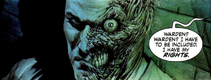
Project: Rooftop featured comic artist Nate Bellegarde's interpretation of the Joker, which got quite a bit of attention:


Personally, I was torn on this piece. Yeah, it's horrific, but when people make the Joker look truly horrific--as Grant Morrison did throughout his current run--it makes me feel like people miss the point of the character. Besides, I just plain dislike a Joker who can do nothing but smile. It reduces a character of hugely operatic moods down to one single, dark, flat note. Blah. Give me an expressive Joker any day.

That said, this piece made me want to track Bellegarde down at a con and commission a Two-Face from him, like, yesterday. So fast forward to today, when [livejournal.com profile] yaseen101 pointed me to the fact that P:R had essentially honored my request:


Now, this is only half of the posted images, but I wanted to talk about these first. It's strikes me as being very inspired by the Harvey of TAS, which I think is particularly clear in the top right drawing. Henchgirl remarked as to how the top left made him look like someone out of Dick Tracy, which in turn reminded me of Haf-and-Haf, and how that character was actually more physically disturbing than classic Two-Face. So too is this take.

The most interesting part, naturally, is the eye. Presumably drawing from images of actual burn victims, the eye here is narrowed down to a small black dot, almost like the eye of a shark. This, in turn, brings to my mind Quint's line from Jaws: "Sometimes that shark, he looks right into you. Right into your eyes. You know the thing about a shark, he's got... lifeless eyes, black eyes, like a doll's eye. When he comes at ya, doesn't seem to be livin'. Until he bites ya and those black eyes roll over white." I wonder if this Harvey's eye could do the same.

That said, I don't really like the eye as a general thing. Classic bulging-eye-o-rage all the way. But I really dig the exposed teeth, and the generally realistic sense of stretched, warped flesh with no distinct line between scarred and unscarred sides. It plays off nicely with Harvey's TAS-style sense of cool noir-era sophistication. So, yeah, I liked this a lot.

But what I loved was the second part:


How do I love this? Let me count the ways.

First, the fact that this sketch does more than actually depict Two-Face, but actually gives a glimpse into his character and psyche. As one person commented, it gives you a real sense of what Harvey Dent has lost. Notice how, in the reflection, Harvey isn't wearing a pinstripe suit. Ah, pinstripes: the short-hand style for gangsters, and a great fashion choice all around.

I love how he's not wearing a split-suit either, but dressing to the hilt of snazziness, letting the horror of his face do all the talking. Speaking of that face, I prefer his "bad eye" here to the shark's eye above. He kind of looks like skull-face Black Mask, only more disturbing and less like a Red Skull ripoff. If we could see this Harvey straight on, I bet his scarred eye would look sunken and perpetually cruel and cold, as opposed to the burning rage of the regular bulging-eye look.

The real kicker is the troubled glimpse into the Harvey Dent that was in the reflection. This is the only time I've ever thought that the Two-face of TAS Season 4--The New Batman Adventures, with the streamlined redesigns--has actually looked good. What's more, he doesn't look like he's plotting evil crimes, sneering in vengeance, of being coolly aloof about something, which are the general personality traits of Two-Face in pin-up art.

At the risk of reading too much into this piece, it seems to me that this Harvey Dent is looking inward--the monster wondering what became of the man in the mirror--and is all too troubled at what he sees. Maybe it's the thought that the man is gone, leaving only the monster. Or maybe it's the possibility that Harvey's still in there somewhere. Even if the latter's the case, Harvey may only be able to see the former.

That's what I get out of this piece anyway. Your mileage may vary. I think it was the cigarette that really pushed me to that interpretation, another classic bit of cinematic shorthand for troubled thoughts. Another neat touch: the fact that he's smoking out of his good side. It makes sense of practical reasons, since that's the side with lips, but it raises some neat implications.

So yeah, this one's going in my all-time favorite Harvey drawings. What think you guys?

Profile

about_faces: (Default)
about_faces

July 2013

S M T W T F S
 123 456
789 10 111213
14151617181920
2122 2324252627
28293031   

Syndicate

RSS Atom

Most Popular Tags

Style Credit

Expand Cut Tags

No cut tags
Page generated Jul. 12th, 2025 07:22 am
Powered by Dreamwidth Studios